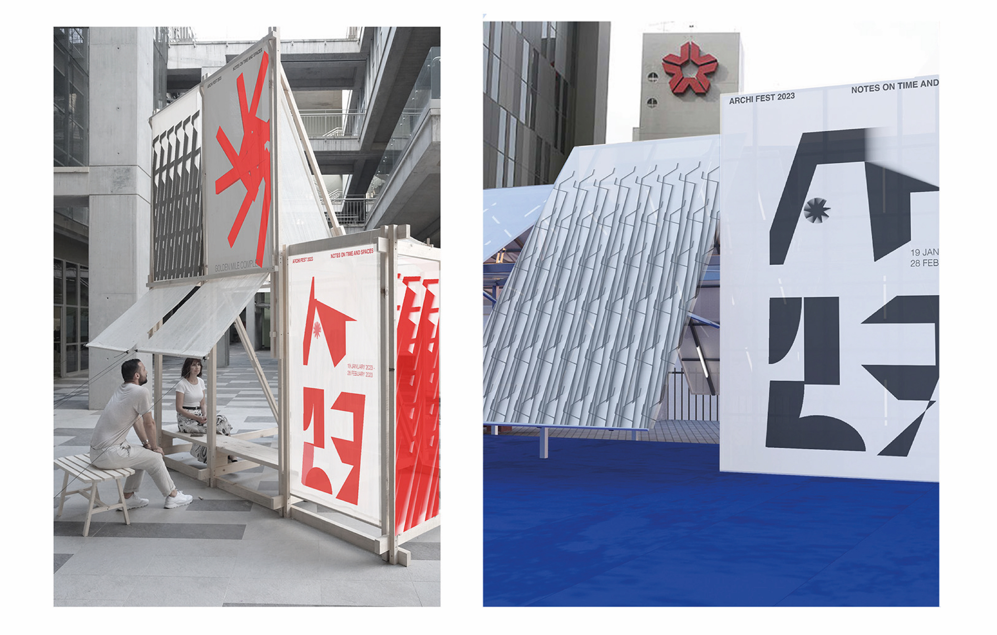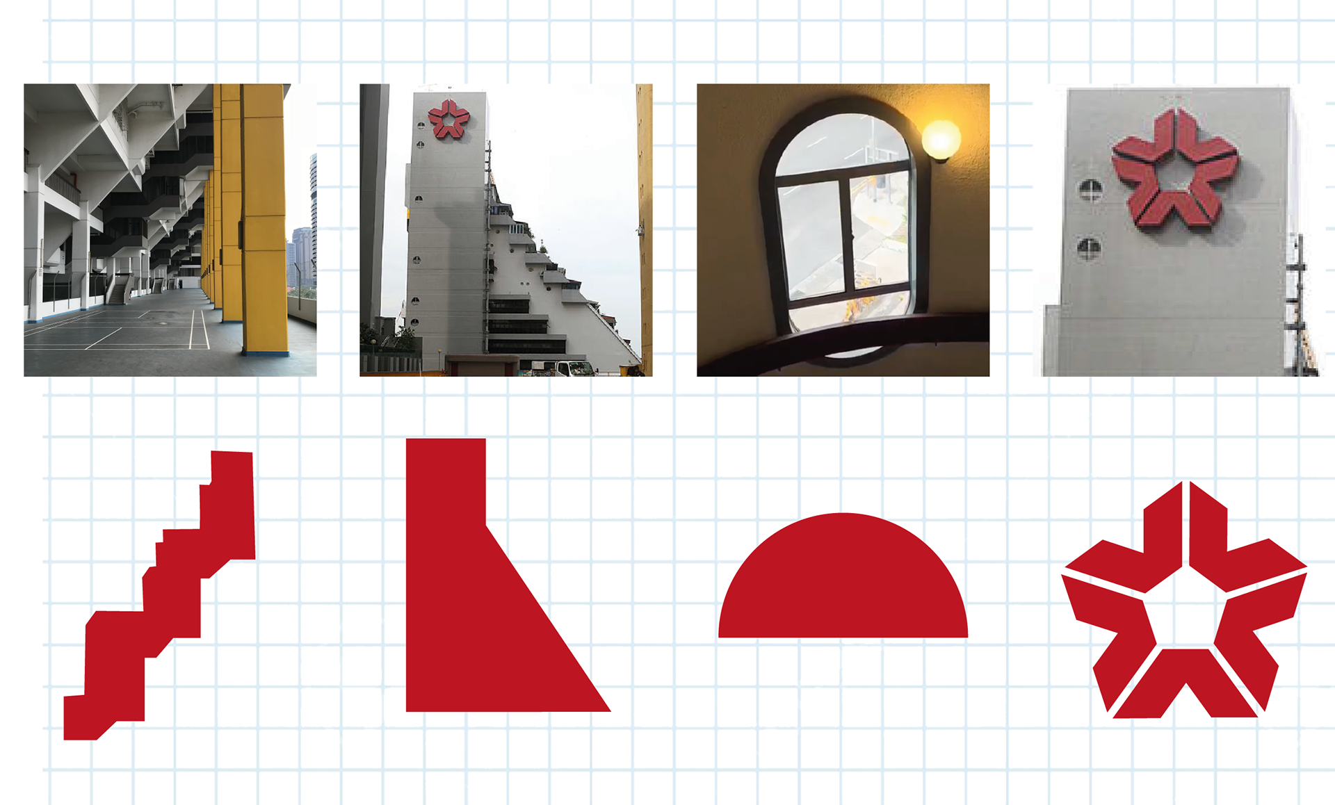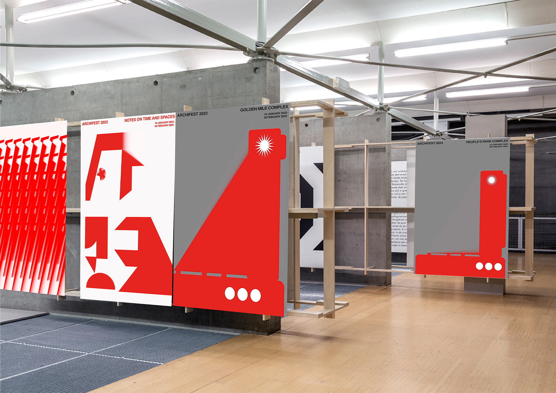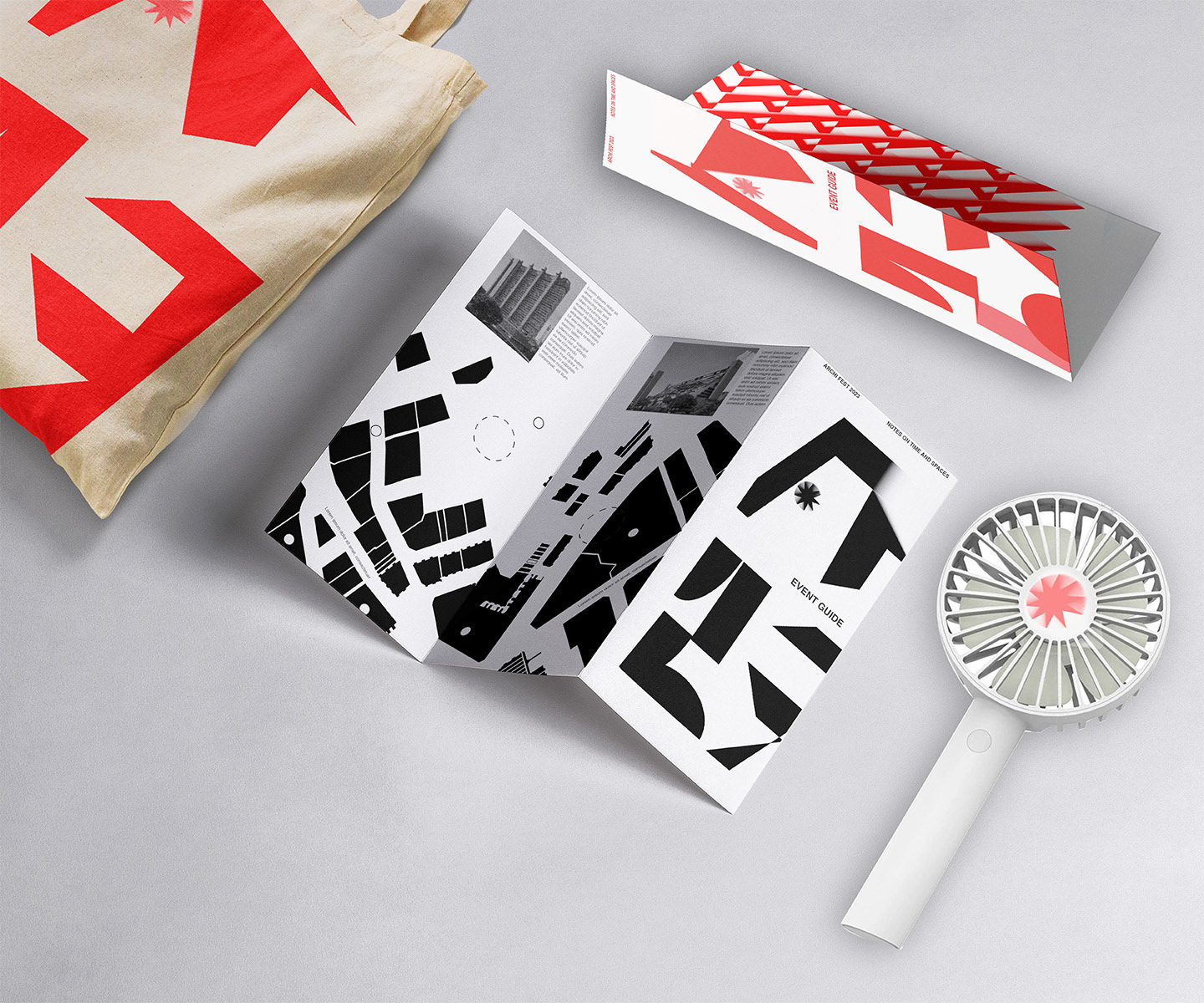
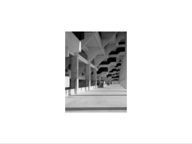
This brand identity project pays homage to the local brutalist architecture, drawing inspiration from its distinct forms and structures. By customizing these forms, they have created a series of visuals that will be used as promotional material for a festival. I explored prominent brutalist landmarks in Singapore, such as the Golden Mile Complex and Tower, noting their unique and representative forms from that era.
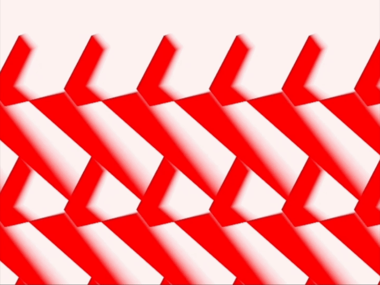
Through the application of innovative functions and transformations to various vertices, they have developed a dynamic logo that almost resembles a new typeface, constructed with simple codes and functions.
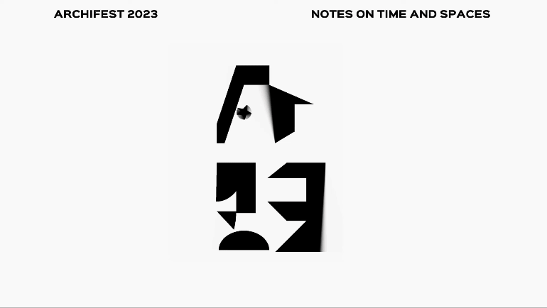
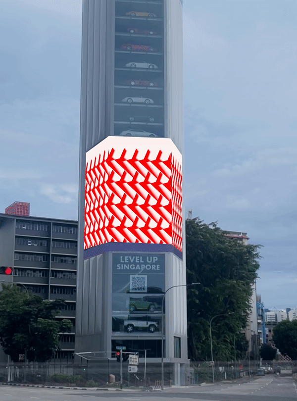
The proposed logo incorporates motion visuals to showcase the potential variations behind each letter, enabling audiences to perceive the interplay between chaos and clarity, reminiscent of brutalist architecture. In line with the project, titled "ArchiFest 2023: Notes on Time And Spaces," the intention is to employ these shapes to represent the concept of time. A secondary visual element incorporates a grid system, inspired by the organizational grids found in brutalist buildings, which can be manipulated across different components of the brand identity. This flexibility allows for the creation of new arrangements that mirror the evolving architectural landscape in Singapore, while also mimicking the formation and movement of both a brutalist building and a clock.